

tl;dr
Set the text color to transparent, add a background image, and set the background-clip property to text.
Have you ever wanted to spice up the text on your site with something besides a simple color, like maybe a gradient or an image? In this quick tutorial, I'm going to show you how to achieve this with only four lines of CSS.
An email from Codepen this week featured a great example of this technique, so I pored over the code to figure out how it's done.
It's actually pretty simple.
Select a big, bold font
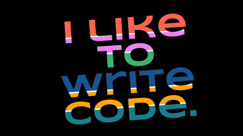
Select a bold font and set it large so there's plenty of area for the background image to show through. The affect is more impressive if the text spans multiple lines.can
Set a background image and make the font transparent
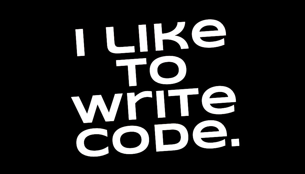
The idea here is to set a background image or gradient on the text and set the font color to transparent. The affect of doing only this, as you'll see, is that you have a pretty rectangle and no text. Your text is there, it's just transparent.
For this example I used a linear gradient for the background image, but any background will do.

Final Step
What we need to complete the affect is to hide--or clip--the background image from everywhere except the text. We do this with the background-clip CSS property.
  background-clip: text;
  -webkit-background-clip: text;
Voila! That's all there is to it.
The final code is in the pen below. Now go make cool stuff.
See the Pen Striped Text by Brent Danley (@brentdanley) on CodePen.